·
4 minute read
·
4 minute read
Sometimes data visuals can offer a lot more to us humans than text can.
You might think adding a bar or pie chart here and there will make all the difference.
It can, but it’s how you present it that makes the impact.

What is the Purpose of Data Presentation?
Whether you thoroughly read or skim a report at speed, using effective data presentation will help any reader understand the content of your research, engage their interest and demonstrate large amounts of complex data in an efficient way.
The famous quote by Statistician, Edward Deming says: “Without data, you’re just another person with an opinion,” demonstrating that using data can back up your argument, but it can also impact decision-making and influence key stakeholders in the process.
Effective data presentation can also eliminate the need for confusing jargon that could impact understanding. No one likes to read a long report or listen to a presentation full of words they don’t understand – so why not replace that with clear and impactful data statistics that really mean something?
Why is data presentation important you ask? Find out exactly why here.
How Can the Outcomes of Effective Data Presentation Improve Public Sector Service Delivery?
Data is the new driving force that can take an organisation down the right path using predictable analysis, allowing organisations to make decisions backed by real-life data, not just opinions.
The outcome opportunities of impactful data presentation are endless, but here are just a few ways the outcomes of effective data presentation can improve public sector service delivery…
- Plan or develop new services that meet the needs of the customer and market better
- Improve performance of analytics programmes that are used by the public or frontline workers every day, such as NHS workers or police using real-life data
- Deliver greater usage opportunities with existing resources to become more efficient in the future by identifying trends, and patterns or using different model scenarios
- Reach a wider audience that could benefit from implementing basic technology that is affordable and easy to use
To make an impact with your data, see the top data and digital courses for public sector professionals in the public sector for 2022.

5 Functional Data Presentation Tips You Should Use in Your Next Big Presentation
Before we get into the good stuff, you need to know a few examples of different types of data that can be presented, including:
- Numerical – data in the form of digits
- Textual – collected material including written, printed or electronically published words, often found in research articles and reports.
- Categorical – textual or numerical data that can be divided into groups such as race, knowledge level etc.
Now, here are five tips that will help you present your data like a professional:
1. Keep your data organisation simple
Whether you want to shout about big numbers or you have lots of data you want to get through, try to avoid visual clutter like animations or chunks of text, as they can distract the audience from the main star of the presentation = your data.
Keep data labels simple but meaningful to the audience, for example, don’t label a chart “sales,” because the audience will have questions from the start. Aim to be specific but don’t use labels that are too long or overly explain what your data shows – you have your voice as assistance!
Also, use clear fonts and colours that complement your data, not take away from it. If you are using multiple charts or diagrams for your data in one presentation, keep your colours the same so the audience can follow along without having to update themselves with a new key for each visualisation.
2. Share just one point from each chart
Details are great, but your audience will get confused if you share everything all at once. Only choose to share details that are specifically related to the data you are sharing at that time – this means you should aim to have one point for every visualisation.
We know that you may have multiple points you want to make, but to keep your audience on the same page, ask yourself this: “What is the key point I want the audience to learn from this data?”
Some call the crucial point that comes from a piece of data, the “Aha!” zone. This is a great way to explain verbally and visually, the most important takeaway from this data. To visually highlight it, you can add a circle or shade in a different colour so they can’t miss it.

3. Make your heavily quantitative data digestible
Big numbers can be scary, so make them friendly to stakeholders or key decision-makers to avoid causing stress by looking at unformatted numbers. It might sound simple, but don’t make your audience count zeros or work out whole numbers due to unnecessary decimals.
Being accurate or precise is important, but if you are using big, long numbers, your audience will leave feeling more confused and overwhelmed than ever. To help with this, especially if you’re using columns or tables, right-align the columns with numbers as this will allow your audience to scan for the big numbers without too much work.
Want to boost your digital skills? Read our blog post to learn techniques to boost your digital skills and enhance your career.
4. Choose your chart wisely
Depending on the message and data you are aiming to convey, you should think about the type of chart you use. There are plenty of options to choose from, such as:
- Column chart
- Area chart
- Line chart
- Pie chart
- Scatter chart
But each of them should be used to demonstrate different things, depending on the data you have and your goal. For example, line charts are mostly used to demonstrate trends or highlight specific points, whereas column charts are used to emphasise or compare two or more things.
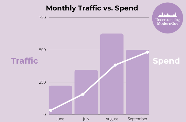
Another tip is to not mix your chart types for no reason unless adding them together reveals insights that would not be possible if left apart. Successfully mixing two chart types can show the similarity between two metrics and help the audience see the connection without using valuable brain power to figure it out themselves.
Take this good example of mixing chart types when presenting data…
If you want to go beyond the basics, try to create your own shapes and use their sizes to reflect proportion, see this example for some ideas:

5. Tell a story with your data
Even if you are presenting your data effectively, one way to make it even more engaging is to tell a story about it. To drive change, make an impact and influence key decision-makers, aim to balance attention-grabbing visuals with a clear story that has a structure – usually a beginning, middle and end so your audience can follow along.
Be sure to understand how your data presentation matches or works with your narrative. Aim to use layers in your narrative to reveal the key elements of the data points you are presenting.
There are lots of options for the public sector, and now is the time to put everything we know in place to harness the full potential of data.
Improve Your Ability to Work with Data with our Data and Digital Courses
Data will be a key player in the success of the public sector in 2023. Be prepared with our range of Analytics courses which will equip you with everything you need to work effectively with data. Secure your spot today.